Anyway, I just returned from the European Cetacean Society in Denmark, which was lovely. Seriously, they have ginger flavoured Pepsi, no wonder Danes are rated the happiest people on earth (despite the high suicide rates…). In general, it was a great conference. Lots of good work, nice people and a prodigious amount of adult beverages.
One thing I did notice, however, was a disturbing trend with plots in both the oral and poster presentations. Many, people did not plot both their data and the model results. Gasp! The horror!
 |
| Not plotting data with predictions |
In all seriousness though, it’s important to show 1) the data 2) the model and 3) the confidence intervals of both (where applicable). It’s also important to do this on the scale that makes sense for your audience. The reasons for this are numerous. First, humans are visual, we can pick up patterns very quickly. Second, properly presenting data allows both the author and the reader to almost instantaneously assess the how well the model fits the data. Plotting data properly throughout the analysis phase also allows the author to “idiot check” the results during the analysis process. This can prevent headaches or embarrassment later on.
I get it learning R is an uphill battle, I’ve been there. Analysing complex, messy data is a challenge to begin with and adding an extra output to deal with is frustrating. This is particularly true for anyone who isn’t wildly in love with stats or coding (many biologists). The challenge is even worse with binomial data which are common outputs in bioacoustic surveys. Still, plotting your data properly throughout will make your life easier.
The goal of this post is to slowly walk through the entire process of plotting binomial data with model outputs. Here I use simulated data such that it should be the same for everybody and attempt to tie it back to biological principles at each step. We will model the output of simulated data using a generalised additive model (GAM). This is a fairly advanced technique so there will necessarily be more jargon in this post than I would ideally like to include. Apologies in advance.
As you follow along I strongly encourage you to write each line of code yourself rather than copy/paste. This process will help reinforce the commands and ultimately make you a better coder by allowing you to start to de-bug your own work.
Step one. I always like to start with a blank workspace. As a human being, I’m
quite messy but as a coder I like things tidy. So first clear anything
you stored using the following line:
#
Clear the workspace
rm(list=ls())
Next
we need to load the library into R that stores the functions for fitting
generalised additive models. If you don't have it already you can use "require".
#
Load the GAM library
library(mgcv)
#
set a random seed, this way your plots will look the same as mine
set.seed(3)
Next
we need to simulate some data. We could use data that were already collected
but by simulating we know the answer already. Moreover, it’s only a few lines
of code rather than digging up something and putting it in a sensible format. I’m
supposed to be writing my thesis, remember?
We
are going to pretend that the probability that the critically endangered bat/bird/frog/whale/cricket
species “Keepitquietus orileaveiesus” is more likely to leave a
potential habitat if that habitat is noisy. Noise is measured in the
appropriate way using calibrated instruments and correcting for microphone sensitivity, gain, a/d conversion etc.
First
we simulate some noise levels. Here let’s scale them to between -1 and 1 such
that -1 is very quiet and 1 is very loud. We will observe the site 800 times
over the course of the season and take noise measurements each time.
#
Noise levels
NL=sort(runif(n
= 800, min = -1, max = 1))
#
First plot of our data. We used a random uniform data simulation process so there should be approximately equal noise levels at each value. Use a histogram to investigate.
hist(NL)
Now
we need to simulate the relationship between ambient noise and the probability that
K. orileaveiesus is
found at our study site. The relationship needs to be sufficiently comples such that GAMs are a valid option for modelling the
relationship. This will initially take the shape of a polynomial
relationship (y = mx^k + b)
alpha.occ=0
# Intercept for the occupancy probability (the b in y=mx+b)
beta.occ=3
# The shape of the relationship between occupancy and noise level (
"m" in y=mx+b)
Now
we introduce the inverse logit function. Since we are working with probabilities, it is
impossible to have detection probabilities greater than one or less than zero.
The inverse logit function transforms our relationship between ambient noise and detection probability such that it matches these criteria. The inverse logit function is simply exp(x)/(1+exp(x)). Here “x” is our complex
relationship between noise levels and K. orileaveiesus which we have put into the form of y = mx +b
# Logit transformed relationship between K. orileaveiesus and noise levels
occ.prob=exp(alpha.occ-beta.occ*NL^3)/(1+
exp(alpha.occ-beta.occ*NL^3))
What
does the probability look like?
plot(NL,
occ.prob)
Now
we have a simulated relationship between the probability of detecting our species and the noise level we measured. Now we need to simulate going to the field
and measuring the noise level 800 times and searching the site for the presence of K. orileaveiesus. Since detecting our species is binomial, either we find it (1) or we didn't (0) we use the “rbinom” function to create random
observations. The binomial function asks us how many times we sample the site (800 in this case), the maximum number of "successes" in each sample (1) and the probability that each sample is a "success" which is our relationship between ambient noise and detection probability. To our probability of success we are also going to add some random noise using the “jitter” function. Yes, “noise”, pun intended.
Observations=rbinom(n=800,
size = 1, prob=jitter(occ.prob))
Now
we plot the data
plot(NL,
Observations)
This
is the crux of the issue, how do we plot the binomial data? This plot is not
super helpful. We can’t make much out of it except, maybe, there are fewer
detections (1’s) when the noise level is high. But we certainly could not see
the cubic relationship from which these data were derived.
So
the approach I use (there are many opinions) would be to bin the data. Let's
now look at the probability of detecting
K.orileaveiesus at 15 evenly spaced intervals
between -1 and 1. To do this we use "cut" function in R. In the
spirit of keeping things neat, at this point I will join my observations (noise
level and observations) into a single data frame.
#
First, lets join all our variables
dat=data.frame(NL=NL,
Obs=Observations)
Now
use the cut function to add a variable indicating which bin the observations
belong to.
dat$bins=cut(dat$NL,
breaks = 15)
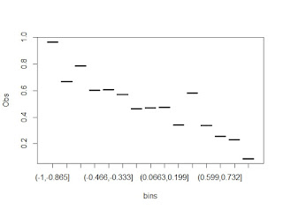
We need the proportion of detections in each
histogram bin. The easiest way that I know to do this is to use the
"aggregate" function in R. I think you could also use lapply or apply
but for I prefer the syntax of aggregate. It makes intuitive sense to me, but
feel free to experiment.
BinnedData=aggregate(data=dat,
Obs~bins, FUN=mean)
In English (or what whatever my general
approximation to English is) this funcation states, what is the mean of the observations
(obs) in each of the noise level bins (bins)?
#plot
the data
Now
we have our data, it looks fairly complex so we will use a GAM to estimate the probability of detecting our species as a function of ambient noise level. let's model it using a GAM. Here we are just back-calculating what we already know (because we simulated the data!). Remember, GAMs must have a smooth
term, here I’ve used a basic smooth ‘s’. If you do not use a smooth in your function call, you are fitting a liner
model-not a GAM. The GAM will take our observations and put them on the logit
scale. This is the inverse of what was described above. We will fix this later.
mod
=gam(data = dat, formula = Obs ~ s(NL), family
= 'binomial')
summary(mod)
Plot
the model results.
plot(mod)
That’s
cool but not many people (myself included) can easily understand data output on the logit scale. Therefore, we need to back-transform our results to
probabilities between 0 and 1. Remember, above we used the inverse logit function to
scale our detection probabilities now we to do it again to the model output.
#
write the inv.logit function
inv.logit=
function (x){exp(x)/(1+exp(x))}
#
now make the plot again with the transformation
plot(mod,
trans = inv.logit)
Ok,
not bad. But from the rug plot at the bottom has the same issue as before. We
really can’t interpret much of anything from it. We need to add the points from
above to the plot. The first step is to get the X values which should represent
the center noise level associated with each NL bin. To do this we will again
use the aggregate function, this time with median (although mean would work
too).
Now
we have another object in our workspace, lets add the relevant bit to our
primary data frame. We can do this
either using merge or stating a new variable. Since I know the column names
between BinnedData and Mids line up, I'll just create a new variable
in my data frame and append the median values from Mids to the primary
dataframe.
BinnedData$NL=
Mids[,2] # second column of Mids
Now add points onto the previous graph
points(x
= BinnedData$NL, y = BinnedData$Obs) # Hey, that's looking better
Lets
make it look even nicer by switching the points to ones that are filled in
points(x
= BinnedData$NL, y = BinnedData$Obs, pch=19)
Almost
there! Finally we should add binomial confidence intervals to our point
samples. You can look this up yourself or use the “binom” package.
library(binom)
First
things first, to calculate the binomial confidence interval we need to know 1)
the number of samples or random draws and 2) how many successes were observed
from the sample. Here success is finding K.orileaveiesus
at the site. We will again rely on our god friend “aggregate” to do this
for us.
#
Length counts how many observation (Obs) are within each bin we made using the
cut function
BinnedData$n=aggregate(data=dat,
Obs~bins, FUN=length)[,2]
BinnedData$sum=aggregate(data=dat,
Obs~bins, FUN=sum)[,2]
Ok,
now we have the number of successes (sum) and the number of draws (n) associated
with each binomial probability. This time lets use cbind (“column bind”-not the
flower) to combine the results of the binomial confidence and the rest of our
data
BinnedData=cbind(BinnedData,
binom.confint(x=BinnedData$sum, n=BinnedData$n, methods = 'asymptotic')[,5:6])
Now
look at your data frame
View(BinnedData)
There
should be two more variables, "upper" and "lower" which
refer to the upper and lower confidence intervals for each point. The last
thing to do is to plot them. I’m using a hack graciously provided by a google
search to do it.
#
intervals
arrows(x0 = BinnedData$NL, y0 = BinnedData$lower, x1 = BinnedData$NL, y1 = BinnedData$upper, code=3,length = .01)
There
you have it. A plot with the data, model
and confidence intervals. It's not the most remarkable piece of artwork (ok,
probably wouldn't win a 3rd grade fair) but you get the idea. A much nicer graph can
be made using ggplot and the predict functions but this is a good start. Hopefully
you found this useful and will, in the future, endeavour to plot binomial data and your models. I
know, it’s a pain and I’ve often forgot to do it-actually I only just figured
out how- but if you’ve made it this far now you don’t have an excuse. Happy
plotting!


No comments:
Post a Comment
Comment forum rules.
1. Be accurate
2. Cite your sources
3. Be nice
Comments failing to meet these criteria will be removed